There are countless tricks to add a little motion to the page CSS and HTML alone; while I love JavaScript and JQuery, if you can find a native CSS solution it is good practice to take it.
I’m not a web-designer so, perhaps it’s silly for me to even post on this. There are terrific references out there on the web and these are pretty basic.
Still, because I used these within this blog’s Jekyll template, I thought I’d point out how they work.
None of the code below requires Jekyll.
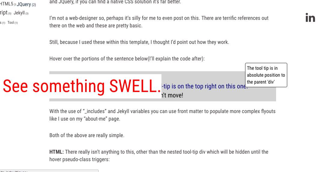
Hover over the portions of the sentence below(I’ll explain the code after):
With the use of “_includes” and Jekyll variables you can use front matter to populate more complex ‘flyouts’ like I use on my “about-me” page.
Both of the above examples are really simple.
HTML: There really isn’t anything to this, other than the nested tool-tip div which will be hidden until the hover pseudo-class triggers:
<div class="demo-swell-tooltip">
  <div>Demo:</div>
  <span class="demo-flyout-left">
    See something SWELL.
  </span>
  <div class="demo-for-top-right">
    The modal box tool-tip is on the top right on this one.
    <div class="demo-tooltip">
      This tool tip is in absolute position to the parent 'div'
    </div>
  </div>
  <div>
    No, the text around the resized items doesn't move!
  </div>
</div>
CSS:
Be sure to make the span container: position: relative and
-
If you’d like it smooth, use a transition effect like ‘ease’:
transition: all 525ms ease; -
for the ‘swelling’ technique to transition both ways set the initial scale to 1
transform: scale(1.0);.
On the :hover pseudo-class all you really need for the ‘swelling’ is
- the size you want to increase to
transform: scale(2.7); - and to be sure to set the z-index in front of the other content if you use a background color especially
z-index: 600;
Here is the CSS for the swell effect including some stying for a change in color
Note the class name and hover syntax:
.demo-flyout-left{
    color: green;
    position: relative;
    transform: scale(1.0);
    display: inline-block;
    transition: all 525ms ease;
}

.demo-flyout-left:hover{
    color: red;
    background-color: white;
    transform: scale(2.7);
    z-index: 600;
}
CODE: for a simple tool-tip:
Here I’m using the “absolute” property as well as “display: none” to reveal the tool tip upon hovering over a trigger “<span>”.
Note: you also have choices of hiding the elements with opacity: 0 or visibility: hidden as alternatives to the display: none I use here. Here is a discussion of the rendering differences at StackOverflow
HTML: Again, the HTML is very simple:
<div class="demo-tooltip-trigger">
  The modal box tool-tip is on the top right on this one.
  <div class="demo-tooltip">
    This tool tip is in absolute position to the parent 'div'
  </div>
</div>
CSS:
The CSS is also very simple but, like CSS can be, it’s that ‘one thing’ you miss that gets you.
The container or “trigger” span or div must be position: relative as well as an ‘display:inline-block’ element to give the position absolute something to anchor onto. You can then display the styled tooltip at offsets to the left, right, top, or bottom of the trigger block. (you’ll likely want to add a width, border, different colors too)
As for the “trigger”, we use the CSS pseudo-element :hover again. The tooltip is initially hidden using display:none and drawn (see linked discussion) by changing the tip CSS to display:inline-block on hover.
.demo-tooltip-trigger{
    color: navy;
    position: relative;
    display: inline-block;
}

.demo-tooltip{
    display: none;
}

.demo-tooltip-trigger:hover .demo-tooltip{
    color: black;
    background-color: white;
    border: 1px solid black;
    border-radius: 4px;
    font-size: .75em;
    padding: 5px;
    z-index: 600;
    display: inline-block;
    position: absolute;
    width: 160px;
    bottom: .75em;
}
Well, again, I’m not a designer and I haven’t broken any new ground here.
That being said, from personal experience, I know it sometimes helps to see another example a specific use case.
Now,
….for a completely cheesy finish:
Hover over this:
<div class="demo-thats-all-container">
    <div class="demo-thats-all-folks">
      That's All Folks
    </div>
</div>
.demo-thats-all-container{
    display: block;
    position:relative;
    text-align: center;
    font-size: 1.5em;
    color: maroon;
}

.demo-thats-all-folks{
    position: relative;
    display: inline-block;
    padding: 10px;
    transition: all 525ms ease;
    height: 100px;
}


.demo-thats-all-folks:hover{
    font-family: cursive;
    transform: translateY(-5em) rotate(360deg) scale(4.0);
    background-color: maroon;
    color: white;
    transition: all 525ms ease;
    z-index: 700;
    border: solid 2px black;
    background: maroon; /* For browsers that do not support gradients */
    background: -webkit-repeating-radial-gradient(circle, red, maroon 10%, black 15%);
    /* For Opera 11.6 to 12.0 */
    background: -o-repeating-radial-gradient(circle, red, maroon 10%, black 15%);
    /* For Firefox 3.6 to 15 */
    background: -moz-repeating-radial-gradient(circle, red, maroon 10%, black 15%);
    /* Standard syntax */
    background: repeating-radial-gradient(circle, red, maroon 10%, black 15%);
}