Tom Norian Site Services an on-call resource for a select clientele

Custom reusable ‘_includes’ - Alternatives to Plugins

This Jekyll Template uses a few ‘plugins’. We have one plugin to allow markdown snippets to be included in HTML pages, and another for external links.

While plugins like those let you use custom Liquid tags in your markup, I have a few issues with them. It took a lot of parsing to separate values you want to pass. The custom parsing also made it harder to extend those plugins, and lastly, you had to remember a lot more syntax when utilizing the tags

That all lead me to think, “there has to be a better way”. I wanted to be able to pass data using mutiple variables and it turns out you can do just that.

We learn by Googling and Experimenting.

My first Widget

I’m not sure what to call this sort of reusable _include, but “widgets” works well enough. I needed to call them something to keep the includes directory tidy.

In Googling the use of variables within ‘liquid’ tags, I cam across this StackOverflow post on how to include a caption on a photo. I wanted to do was similar: creating way to put inline photo’s within my markdown in a way that I could easily not only include caption and ‘alt’ fields, but also adjust the width of a photo.

It turned out to be a very straightforward thing to do that really makes it easier to have more media within a post.

How to use variables with includes

It’s simple.

Here is a standard _include that you might use to insert your site title and slogan partial named ‘title-group.html’


  {% include title-group.html %}

You could pass that ‘title-group.htm’ a variable to customize that slogan.


  {% include title-group.html custom-slogan="whatever you say dude" %}

Now, before moving to how that works lets consider the limitations of basic markdown images.

Here is how you can use the most basic markdown image tag:


  ![alt text](https://github.com/adam-p/markdown-here/raw/master/src/common/images/icon48.png "Logo Title Text 1")

But, what if you want to change it’s width or add a caption? And, without a class, you’d have a hard time styling those inline images.

Here’s the solution I came up with.

Directions for inserting Inline images in your blog posts

Cut and paste the code below and substitute and delete as desired:


{% include image-inline.html url="/images/subfolder-in-images/filename.png" width="33%" alt=page.post-title caption="whatever you want here(or nothing)" class="optional-further-styling-class" %}

  • url is the path to the image

  • width is a string with a number and the ‘%’ symbol (“100%” will span the full text collumn, “33%”” will have blog text wrap around the third it takes up)

  • url is what screen readers see as well as having important SEO ramifications. You can set it with front matter like I did or include custom text like “whatever words give me the best Google score”

  • caption is a bold lable text directly beneath the photo. Like with “alt” you could use front matter instead.

  • class another optional, field, this would help you style different types of inserts(maybe you wanted all table images have a border?).


If you just want to use this feature you don’t need to read the rest of this: follow the instructions in the section immediately above.

HTML: Here is the markup that the using the “image-inline.html” include ‘widget’ will generate:


<span class="tn-image-inline {{include.class}}" style="width:{{include.width}}">
  <img src="{{ include.url }}" alt="{{ include.alt }}" title="{{include.caption}}" width="100%">
  <label class="tn-image-inline-caption">{{ include.caption }}</label>
</span>

CSS:

.tn-image-inline{
    position: relative;
    display: inline-block;
    float: left;
    padding: 0px 20px 0px 0px;
    text-align: center; 
}

I’m really glad I can use Jekyll create these reusable widgets. They do walk a line towards expanding the liquid domain specific language but short of a GUI on a CMS, it’s a very simple way to go.

In another post I show how to use the same concept to create togglable page sections


There are countless tricks to add a little motion to the page CSS and HTML alone; while I love JavaScript and JQuery, if you can find a native CSS solution it is good practice to take it.

I’m not a web-designer so, perhaps it’s silly for me to even post on this. There are terrific references out there on the web and these are pretty basic.

Still, because I used these within this blog’s Jekyll template, I thought I’d point out how they work.

None of the code below requires Jekyll.

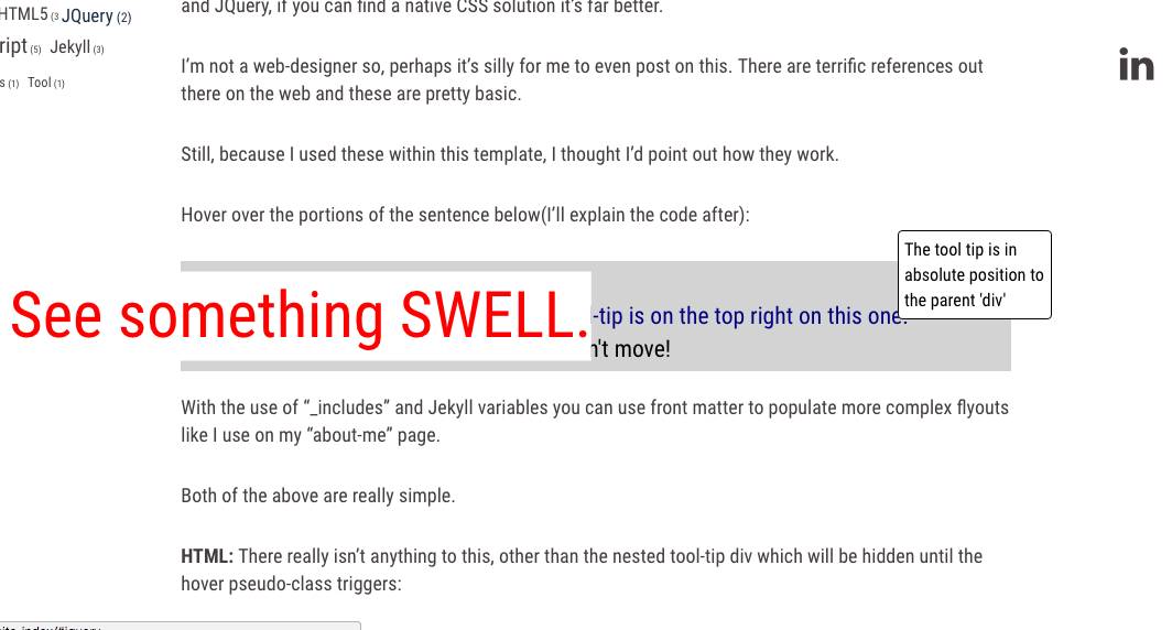
Hover over the portions of the sentence below(I’ll explain the code after):

Demo:
See something SWELL.
The modal box tool-tip is on the top right on this one.
This tool tip is in absolute position to the parent 'div'.
No, the text around the resized items doesn't move!

With the use of “_includes” and Jekyll variables you can use front matter to populate more complex ‘flyouts’ like I use on my “about-me” page.

Both of the above examples are really simple.

HTML: There really isn’t anything to this, other than the nested tool-tip div which will be hidden until the hover pseudo-class triggers:

<div class="demo-swell-tooltip">  
  <div>Demo:</div>
  <span class="demo-flyout-left">
    See something SWELL.
  </span>
  <div class="demo-for-top-right">
    The modal box tool-tip is on the top right on this one.
    <div class="demo-tooltip">
      This tool tip is in absolute position to the parent 'div'
    </div>   
  </div>
  <div>
    No, the text around the resized items doesn't move!
  </div>
</div>

CSS:

Be sure to make the span container: position: relative and

  • If you’d like it smooth, use a transition effect like ‘ease’: transition: all 525ms ease;

  • for the ‘swelling’ technique to transition both ways set the initial scale to 1 transform: scale(1.0);.

On the :hover pseudo-class all you really need for the ‘swelling’ is

  • the size you want to increase to transform: scale(2.7);
  • and to be sure to set the z-index in front of the other content if you use a background color especially z-index: 600;

Here is the CSS for the swell effect including some stying for a change in color

Note the class name and hover syntax:


.demo-flyout-left{
    color: green;
    position: relative;
    transform: scale(1.0);
    display: inline-block;
    transition: all 525ms ease;
}

.demo-flyout-left:hover{
    color: red;
    background-color: white;
    transform: scale(2.7);
    z-index: 600;
}


CODE: for a simple tool-tip:

Here I’m using the “absolute” property as well as “display: none” to reveal the tool tip upon hovering over a trigger “<span>”.

Note: you also have choices of hiding the elements with opacity: 0 or visibility: hidden as alternatives to the display: none I use here. Here is a discussion of the rendering differences at StackOverflow

HTML: Again, the HTML is very simple:


<div class="demo-tooltip-trigger">
  The modal box tool-tip is on the top right on this one.
  <div class="demo-tooltip">
    This tool tip is in absolute position to the parent 'div'
  </div>   
</div>

CSS:

The CSS is also very simple but, like CSS can be, it’s that ‘one thing’ you miss that gets you.

The container or “trigger” span or div must be position: relative as well as an ‘display:inline-block’ element to give the position absolute something to anchor onto. You can then display the styled tooltip at offsets to the left, right, top, or bottom of the trigger block. (you’ll likely want to add a width, border, different colors too)

As for the “trigger”, we use the CSS pseudo-element :hover again. The tooltip is initially hidden using display:none and drawn (see linked discussion) by changing the tip CSS to display:inline-block on hover.


.demo-tooltip-trigger{
    color: navy;
    position: relative;
    display: inline-block;
}

.demo-tooltip{
    display: none;
}

.demo-tooltip-trigger:hover .demo-tooltip{
    color: black;
    background-color: white;
    border: 1px solid black;
    border-radius: 4px;
    font-size: .75em;
    padding: 5px;
    z-index: 600;
    display: inline-block;
    position: absolute;
    width: 160px;
    bottom: .75em;
}

Well, again, I’m not a designer and I haven’t broken any new ground here.

That being said, from personal experience, I know it sometimes helps to see another example a specific use case.

Now,

….for a completely cheesy finish:

Hover over this:

That's All Folks


<div class="demo-thats-all-container">  
    <div class="demo-thats-all-folks">
      That's All Folks
    </div>
</div>


.demo-thats-all-container{
    display: block;
    position:relative;
    text-align: center;
    font-size: 1.5em;
    color: maroon;
}

.demo-thats-all-folks{
    position: relative;
    display: inline-block;
    padding: 10px;
    transition: all 525ms ease;
    height: 100px;
}


.demo-thats-all-folks:hover{
    font-family: cursive;
    transform: translateY(-5em) rotate(360deg) scale(4.0);
    background-color: maroon;
    color: white;
    transition: all 525ms ease;
    z-index: 700;
    border: solid 2px black;
    background: maroon; /* For browsers that do not support gradients */
    background: -webkit-repeating-radial-gradient(circle, red, maroon 10%, black 15%);
    /* For Opera 11.6 to 12.0 */
    background: -o-repeating-radial-gradient(circle, red, maroon 10%, black 15%);
    /* For Firefox 3.6 to 15 */
    background: -moz-repeating-radial-gradient(circle, red, maroon 10%, black 15%);
    /* Standard syntax */
    background: repeating-radial-gradient(circle, red, maroon 10%, black 15%);
}


For alternative access, I include the READ_ME.md file for this site’s Jekyll template below:


Cheap and Easy Jekyll Blog Template for Web Developers

Usage

Once you have Jekyll fully installed clone the repository and delete my content in Posts, and the collection folders after you’ve used them as demos.

git clone https://github.com/Tom2277/tn-easy-weblog.io my-blog

Getting started with Jekyll ?

See my links in this post: Jekyll Blogging for Web Developers

The post above discusses some of the choices I made as well as links to other posts about how some of the template features are implemented.

You’ll also want to consult those external links for actual deployment.

Global Variables

  • Go to the _global.yml file in the _data directory and substitute in your own information
    • Note that you’ll need to switch back and forth between the base URL of your local host and your production server address when you run the server locally.

Front-matter Conventions for this Template

  • page-label: < optional page title that will appear in addition to the title of your post header >
    • for example Blog at the top of the blog role or Site-Index ? Attention Cat Owners for cat posts?
  • post-title: < insert a title you want to give a post like “Wonder Cats” >
  • post-subtitle: < insert a line like “including information on feeding”>
  • lead-image: < image file name or URL within images folder i.e. my_photo.png or blog/my_phot.jpg >
    • This image will be displayed in post or collection item’s header and in menus*>
  • post.excerpt is standard Jekyll functionality (It does not need to be included in front matter.)
    • on this template, insert <!–more–> within your posts to set the break point.
  • author: < type in name of author or creator(collection) >
    • optional: if left blank no author will appear
  • subject-tags: < insert an array of tags on separate lines below with a ‘-‘ in front.>
    • ‘Subject tags’ bypass the Jekyll tagging and category system. I chose this custom method to allow the same tags to work with both ‘posts’ and ‘collections’
  • activity-tags < insert an array of tags on separate lines below with a ‘-‘ in front.> *
  • website-name: < external website-name under post image if desired>
  • website-url: < external website full URL if desired - will open in new tab >

Markdown info

  • Kramdown This template uses the Kramdown flavor of mardown. Most standard markdown works
  • Code Blocks Use three back ticks followed by a lower case language name, on separate lines before and after your code.
    • this template uses the pygments gem an I’ve chosen the ‘monokai’ code highlighting scheme (with a few alterations).
    • you can include a different color scheme by substituting it’s scss files in the appropriate folders
  • See my blog for custom tags: external links, inline images, toggle code blocks, including markdown segments within HTML and more.

Credits:

I initially started with the Bootstrap Blog template included with this tutorial by Nicholas Cerminara at Scotch.io. There is little left of his code although his folder structure and a few css features, including pagination, still remain. Either way, thanks are due.

The entire CSS layout structure is built using Twitter’s Bootstrap

Most of all we need to thank the Jekyll community.

You are welcome to reuse my code as per the following license. (as Twitter and N Cerminara used as well)

The MIT License (MIT)

Copyright (c) 2016-2017 Thomas Norian,

Permission is hereby granted, free of charge, to any person obtaining a copy of this software and associated documentation files (the “Software”), to deal in the Software without restriction, including without limitation the rights to use, copy, modify, merge, publish, distribute, sublicense, and/or sell copies of the Software, and to permit persons to whom the Software is furnished to do so, subject to the following conditions:

The above copyright notice and this permission notice shall be included in all copies or substantial portions of the Software.

THE SOFTWARE IS PROVIDED “AS IS”, WITHOUT WARRANTY OF ANY KIND, EXPRESS OR IMPLIED, INCLUDING BUT NOT LIMITED TO THE WARRANTIES OF MERCHANTABILITY, FITNESS FOR A PARTICULAR PURPOSE AND NONINFRINGEMENT. IN NO EVENT SHALL THE AUTHORS OR COPYRIGHT HOLDERS BE LIABLE FOR ANY CLAIM, DAMAGES OR OTHER LIABILITY, WHETHER IN AN ACTION OF CONTRACT, TORT OR OTHERWISE, ARISING FROM, OUT OF OR IN CONNECTION WITH THE SOFTWARE OR THE USE OR OTHER DEALINGS IN THE SOFTWARE.